
Excel 2016 new features
With every release of the Office suite, Microsoft introduces a number of new features. In this lesson, I’ll show you the Excel 2016 new features and most important ones that were introduced in Excel 2016, and explain how you can use them to speed up your work.
Excel 2016 User interface
With every new edition of Excel, the user interface is slightly modified. The biggest revolution so far was the introduction of the ribbon in the 2007 version of the suite.
But also in Office 2016, there are a few changes in the interface that are worth mentioning.
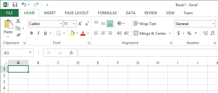
Excel 2013
Excel 2016
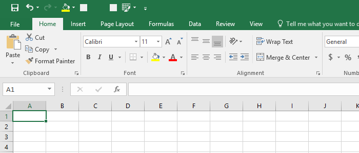
As you can see the UI in Excel 2016 is slightly modified compared to Excel 2013. Besides the green stripe at the top of the user interface, the ribbon also became darker.
The next thing that may not be obvious right away is the slight change in tabs categories. If you look at the ribbon tabs, they are no longer labeled in all caps.
Microsoft came to the conclusion that if you use the capital letter only at the beginning for each word, the word becomes more readable.
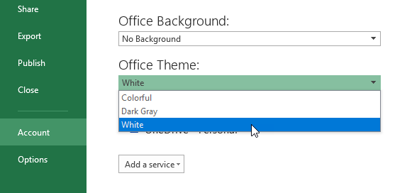
If you liked the previous UI, you can change it in File >> Account >> Office Theme >> White and the interface will be exactly the same as it was in Excel 2013.
Tell me what you want to do…
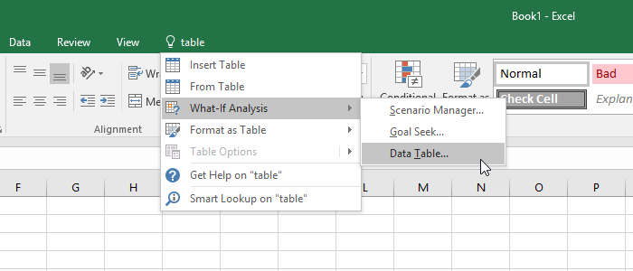
Another new feature that Microsoft added to Excel 2016 UI is the Tell me what you want to do… option. It is located on the ribbon, after the last tab.
In order to use it, just click inside the field or use the Alt + Q shortcut, then write what you want to do.
This feature is useful if you want to execute a command, but you are not exactly sure where to find it.
Just write a word that you are interested in, and the number of options that consist of the following phrase will appear.
In the example below, I typed the word “table”, and all commands that consist of this word appear.
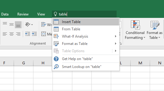
Sometimes, the word isn’t inside the main command, but after you expand, you can find it in one of the subcommands.
Additional shape styles
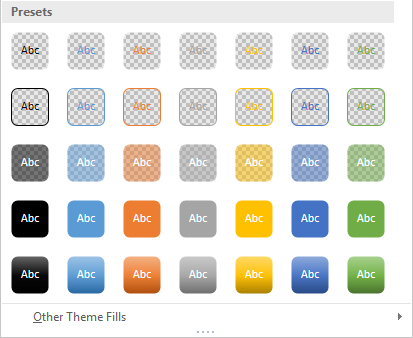
Another feature that was added in Excel 2016, is the ability to use shape patterns. Go to Insert >> Illustrations >> Shapes and choose a shape.
Now, a new Tool tab appears (Drawing Tools >> Format). Click the More button to expand the Shape Styles.
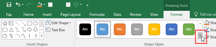
What changed since Excel 2013 is the number of shape modifications. Now, you have not only Shape Styles, but also Shape Presets.
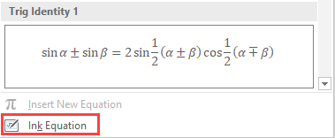
Ink equation
When it comes to inserting math equations into Excel 2013 spreadsheets, there are some ways you can do it. In OneNote 2013, however, you can use something called Ink to Math feature.
If you have a graphical tablet or a touchscreen, you can write a formula that is translated into a typed format.
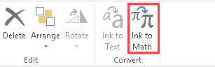
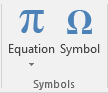
Now, you can also do it in Excel 2016. Go to Insert >> Symbols >> Equation.
At the bottom of the list, you will find an Ink Equation feature.
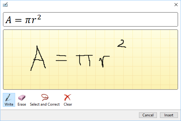
When you click it, a new window will appear where you can write your formula. The best way to use this feature is by using a tablet or a touchscreen, but you can also use your mouse.
When you write a formula, Excel will be correcting the formula in the process.
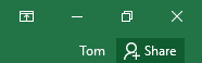
Sharing files
In Excel 2016, collaborating with others is easier than it was in Excel 2013 and earlier versions. Now, you can use it directly from Excel 2016, by clicking the Share tab located in the upper-right corner.
With this feature, you can share files with friends, or even allow them to make changes to the file simultaneously.
In order to use this feature, you have to press the share button. If you haven’t already saved it to the cloud, you will be asked to do that.
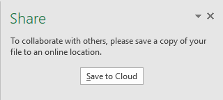
You can save it to a SharePoint site or even your personal OneDrive account, where you can get a free space in the cloud.
After you do it, the Share field will look a bit different.
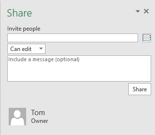
Here, you can choose people you want to share your files, set permissions (view or edit), and include a message with that file.
Smart Lookup
The next new feature in Excel 2016 is called smart lookup.
If you use Excel 2013, you may be familiar with the feature known as Office Insights. It lets you select content in a document and look up the information online, directly from the document.
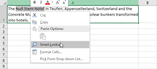
In order to check the information online, select a text you want to look up, then right-click and choose Smart Lookup.
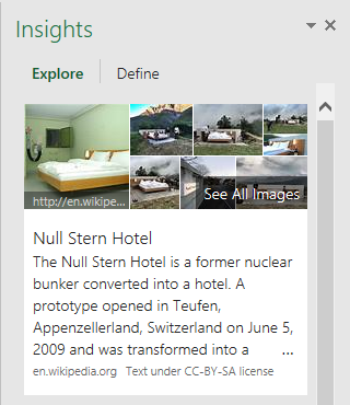
On the right side, information about the selected phrase is going to appear.
New graphs and charts
In Excel 2016, there are 6 additional charts that weren’t available in the earlier versions of Excel: treemap, sunburst, waterfall, histogram, Pareto, box & whiskers.
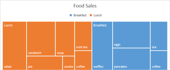
Treemap
You can use the treemap chart if you need a hierarchical view that makes easy to spot patterns, for example, which item is the best seller. The category is presented as a big rectangle consisting of smaller rectangles.
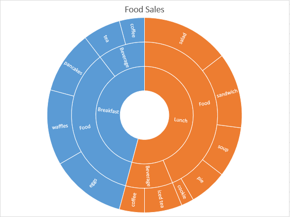
Sunburst
The sunburst chart is similar to a doughnut chart. But the sunburst chart with multiple levels of categories shows how the outer rings relate to the inner rings. If you have a lot of data, some text inside a chart becomes abbreviated or the text is not displayed at all.
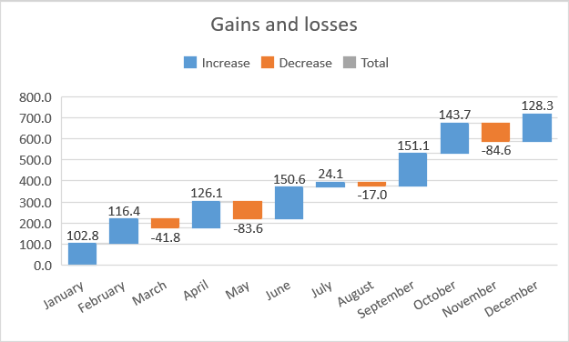
Waterfall
The waterfall chart is useful if you want to understand how the initial value is affected by a number of positive and negative values.
By default, the positive values are shown as blue rectangles and the negative by orange rectangles.
With this chart, you can visualize gains and loses in your company.
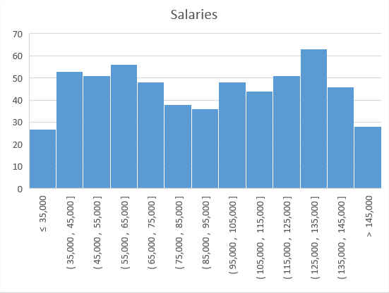
Histogram
The next chart type that is new in Excel 2016, is the histogram chart. In the earlier releases of Excel, you can create a histogram using the FREQUENCY function. Then you have to set up our data in bin ranges. You don’t have to do it anymore.
This type of chart is great to visualize the ranges of salaries in a company.
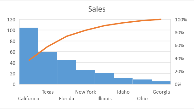
Pareto
Pareto chart contains both a column chart, sorted in descending order and line chart representing the cumulative total percentage. In the previous Excel releases, in order to create the Pareto chart, you need the formula to count the percentages. You don’t need this in Excel 2016.
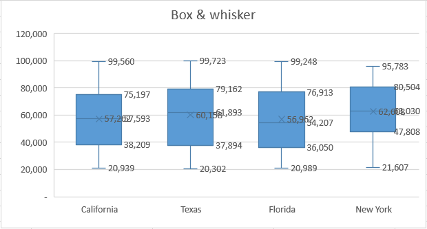
Box & whisker
This type of chart is related to stock charts and is commonly used in statistical analysis. It shows the distribution of data into quartiles, highlighting the means and outliers. The boxes have lines extending vertically called “whiskers”. They indicate the variability outside the lower and upper quartiles.
In next tutorial i will Write about Interface like Start Screen and Application window. Hope that it helps for you guys.
Related Posts


About The Author
AYYU
I am a blogger since 2010 and I’m the author of this website I'm a systems/network administrator and I enjoy solving complex problems and learning as much as I can about new technologies. I write tutorials based on my work experience and other IT stuff I find interesting. since 2006 in online world also I am a troubleshooter for the well-known website like http://www.fixya.com and many more groups